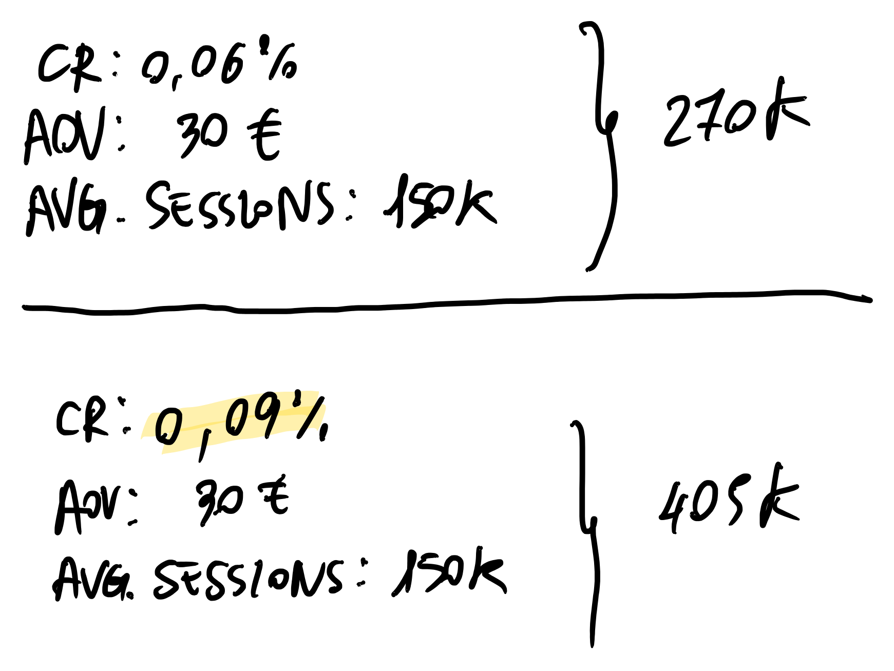
Conversion Rate is the result of calculation between the number of generated sessions and the number of obtained orders. In other words: its goal is to increase the sessions' quality and sales products' value.
Conversion Rate optimization activities are very important when sales volume lead to a substantial turnover.
Example

Improve the Conversion Rate by 30% (leaving unchanged the rest) in a system that continues to change over time, due to new marketing campaigns, external partners activities, etc. it really means making the difference.
Variation of the conversion parameters are determined by linked factors, such as the browsing behavior metrics (Bounce rate, avg. Time on page, avg. Page per sessions), platform internal factors (slow navigation, inconsistent or few information, incorrect validation fields, incorrect merchandising composition, etc.) and external ones (marketing campaigns not focused on audiences in line with the shop's products, incorrect creative communications, etc.).
Let's take for example a customer path (or journey) that from mobile begins his web surfing on the shop landing on the homepage, clicking on the search bar and fill it out with the product name, then clicking on the first result and he lands on the product page. Then, added the product to the cart, he arrives at the checkout filling out shipping information and payment form to complete the order.
During this web surfing, the customer sees several pages where there may be missing information to make him able to proceed to the next step – maybe it's something related to product details or shipping information, all of them are missed opportunities and/or errors to fix (leaving outside of consideration technical issues he could encounter browsing).
The CRO main purpose is to analyze the "fall/exit points" (or pitfalls) and understanding the "why" through deep qualitative and quantitative analysis.

Using experimentation method in a scientific way, we can work out the issues that afflict user browsing and implement new specific solutions to avoid decreasing the pitfalls and increase conversions at the next step of funnel browsing.

How to read journey in Google Analytics
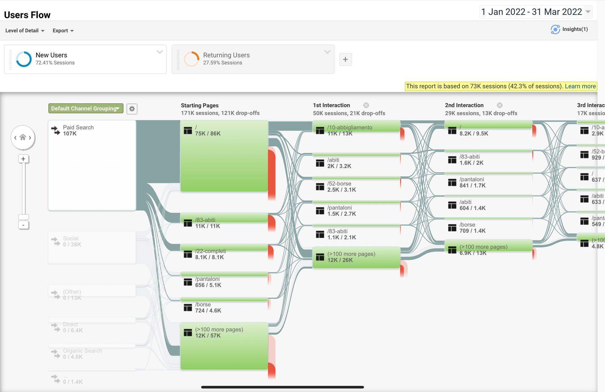
In the "Audience" section, the User Flow in Google Analytics is a graphical representation of users' path through the various pages up to their exit. This report allows you to compare traffic volumes from different sources, examine traffic patterns on the site, and troubleshoot site efficacy.
What is the difference between Behaviour Flow and User Flow? The difference is in the attention that Analytics dedicates to data by concentrating site's content on the latter rather than on user navigation.
Both flows are complementary for analyzing surfing purpose behaviour, detecting behavioural patterns, and identifying the Customer Journey.

Gathering by channel type helps to understand how the web surfing of this audience takes place through different pages and how many steps are needed to sell.
Customer journey analysis needs further insights because each channel intercepts several customer segments (different demographics, type of device, etc.). Therefore, it is always advisable to start with the most critical user group, once identified, to use the two flows to understand how browsing takes place and which contents are more exciting and which are less...
Heuristics' field
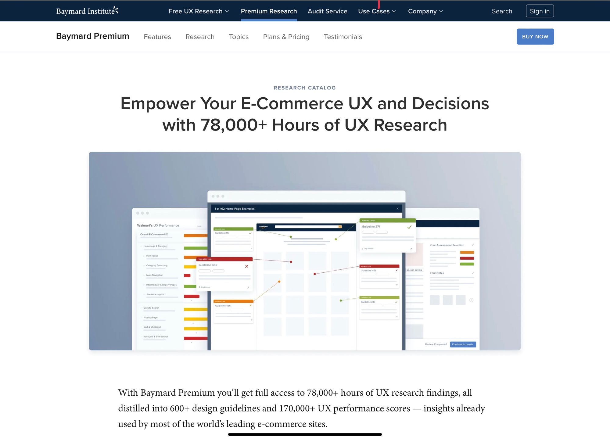
Referring to the heuristics of your product sector is a good starting point to shed light on what works and what needs to fix them immediately. On the Baymard Institute website, it's possible to filter the experiments by product category and identify the most important ones per shop page.

Why follow the sector heuristics?
Because following these best practices avoids the improper use of "in my opinion", leaving room for the objectivity of the results of the experiments that have been successful and therefore determine to date the guideline to follow and avoid losing sales.
Conversion performance is the metric that guides - most of the time - the experiments' outcome.
Below, you will find some suitable recommendations for all product sectors, recognized for years as fundamental for a Better Customer Experience and conversion optimization from Baymard Institute.
# Heuristic #1 - Search

Header searching bar
The search field represents the first step of the user's search process or the fastest to reach the product he desires to buy.
Therefore, the search field design is the crucial element for creating a great search experience, and it can influence the whole user's approach to how finds products on the website.
About what features are essential to pay attention to:
- Design: Position, Contrast and Size of the field;
- Autocompletion (powered by IA) is collateral to show the best search results to users;
- Orthographic errors or misspellings;
- Provide alternative products in case of no or negligible results.
Search by category
The filters on the left sidebar or horizontally above the category filter results should have:
- Search by product type
- Search using the attributes found in the listed products
- Total number of results
- Text search with autocompletion
Heuristic #2 - Product Page
Here are some recommendations divided by the type of business.
Shop with local stores
- Enter "Get in-store" next to the buy button;
- Enter "Find a Store" next to the purchase buttons;
- Show information about shipping times under the action keys;
- Show the return policies in brief.
B2B Shop
- Show information about shipping times under the action keys;
- Detailed information regarding the construction of the product, the origin of manufacture and any information concerning it;
- Specification of the unit of measurement used and related conversions in the different countries where there are sales;
- Show cost per piece and, if available, the price for multiple purchases.
Generic Shop
- Show the Size Guide as precise as possible to ease the conversion into other measures for potential customers of different nationalities present in the territory.
- Show a total order cost next to the buy button (including shipping)
- Enter a cross-sell section that recommends complementary products
- Insert a section dedicated to returning policies and methods
- Show shipping times
- Show reviews related to the product
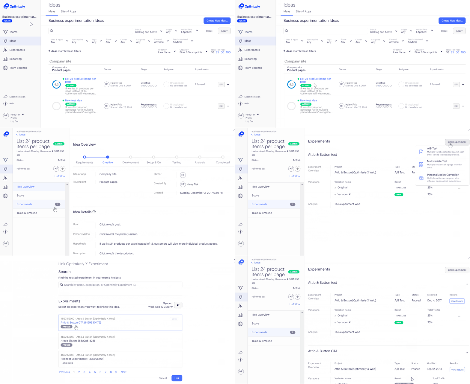
Planning these activities to "normalize" your shop's performance is an excellent way to start. Then, all that remains is to monitor the trend and carry out continuous experiments (A / B testing, Multivariate Testing, etc.) to improve sales performance continuously.
Shops are not created to be unchanged over time but live continuously on "updates" of the design according to the scientific evidence of the experiments to optimize conversions.

