
Google Data Studio is a free reporting tool to create highly customizable dashboards and visualizations from different data sources.
It’s important to track metrics across your website and sales funnels. After all, not keeping an eye on your analytics could mean missing out on key business insights. But what if you’re making decisions based on wrong data without knowing it?
I’ve been working on creating some Data Studio reports when I needed insights to analyze different business sections, and some days ago, I crafted a simple dashboard for a better analysis of the customer base through a Google Analytics connection.
In this report, you can understand correlations between device categories and conversion rates, interests in CR, channels on average prices and AOV (average order value), and other interesting metrics.
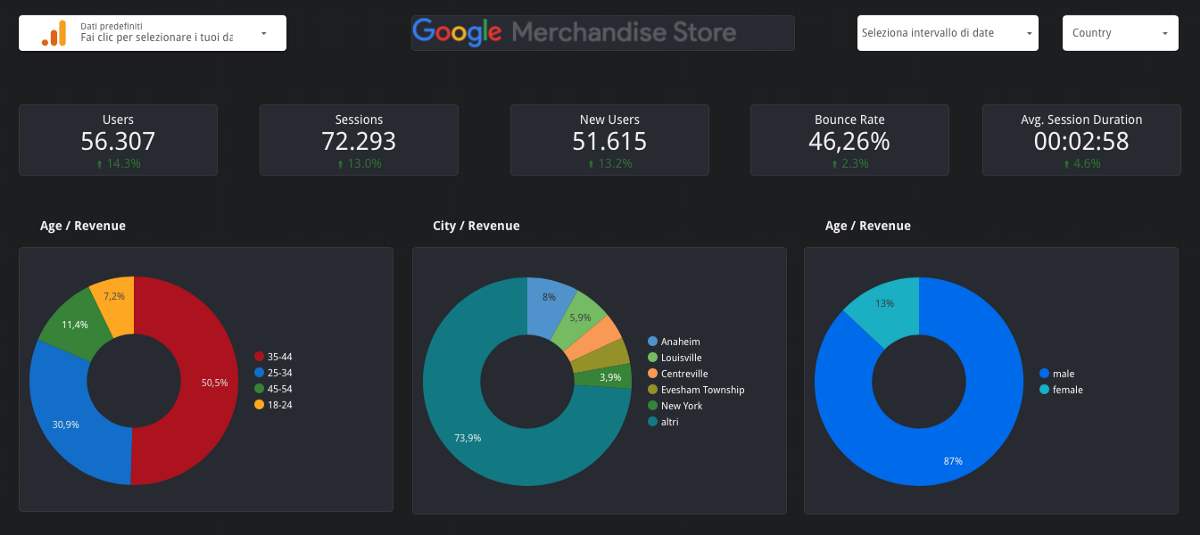
In the first part of the report, you can see the most important KPI such as Users, Sessions, New Users, Bounce Rate and Average Session Duration in the period selected in the top right corner of the dashboard and its comparison with the previous period in percentage.
The section below contains the demographic dimensions with the revenue metric. It could be interesting, too, if you consider putting these dimensions with the Unique Purchases metric…
Device Categories, Channels and Time.
The report is structured to show important information based on the conversion rate and three other dimensions that let me know where they’re coming from, what are their interests and readings and at what time they usually feel more comfortable purchasing.
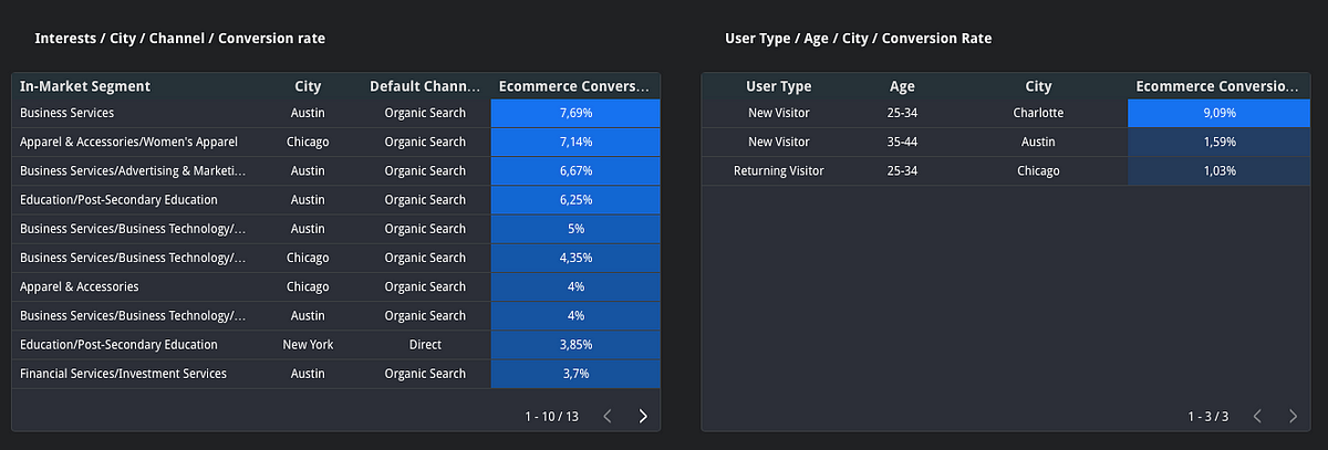
1. Channels
The channel of origin is one of the most important dimensions to keep an eye on to understand where your customers are and how to uplift the marketing campaign ROAS.

What is the most profitable channel based on the conversion rate?
These questions should sound pretty interesting for most of the marketers around out there. As you can see in the screenshot below, the report shows the result aggregated information where you should go deep inside the data and explode and activate them through other Google Cloud products.
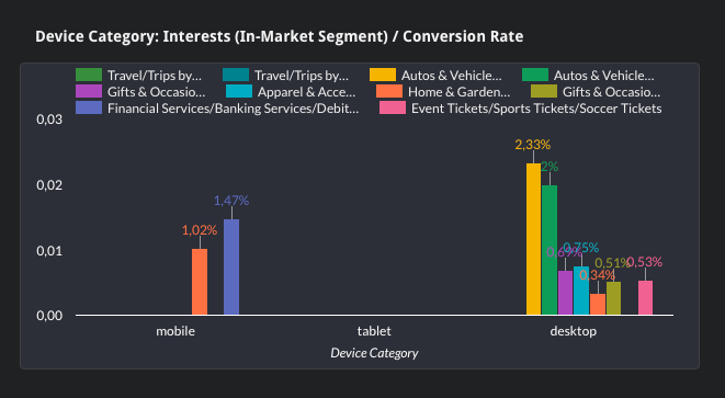
2. Device categories dimensions
Each of these 4 charts shows a specific answer on the customers’ profiles: the following screenshot shows different insights from different angles, enlightening the interests, channels, location, and age on device categories and E-commerce conversion rate metrics.

Mixing up these charts lets you create detailed information about your customers' success to understand how to uplift your marketing performance bidding and conversion rates.
Based on the device category, what is the highest conversion rate of customers’ interests?
The following chart shows you the answer to these questions, and it could be really interesting to understand how to optimize your bidding information or perhaps understand better how to aggregate information about your customer segments; you could be able to drive better communication or some specific offers related to their hobbies too.
3. Time
Google Analytics samples all data to analyze and uncover meaningful information in the larger data set. In the following screenshot, you can see a matrix with Sessions, E-commerce Conversion Rate and AOV on Hours of the day, which show you the most hours of the week when you should concentrate your attention.
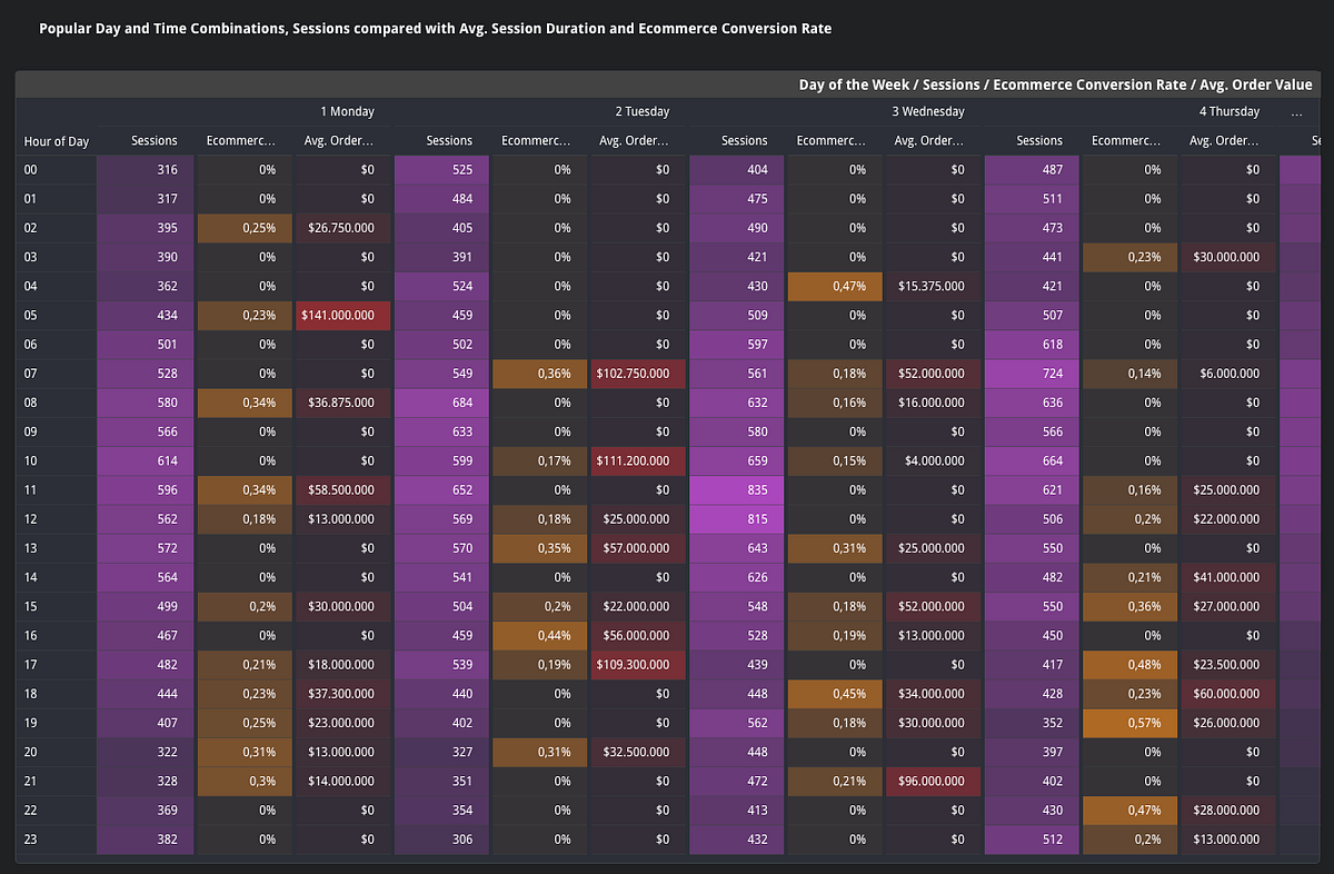
What is the highest time and day of the week when customers focus on buying?
For each day, I considered combining the sessions, conversion rate percentage and revenue in a matrix with the sampling of the week and hours. In this way, it shows me the most important “gain points” related to an economic value and not only the conversion rate percentage metric, which could be high for a particular time/day/session but not relevant in business terms.