
The Challenge
Being a spin-off company of Amodio Group SpA, the expectations were really high; the main challenge was to fix previous marketing and UX issues, to uplift conversion rate and give a boost to their online business.
The time to apply this change was really challanging: 3 months at all!
The Solution
I moved fast in a growth process, delivering fast all experimentations for increasing customer retention and get the first analytics.
When the experimentations went really well, I moved to focussing on specific issues, creating more landing pages to analyze and isolate conversion rate pitfalls.
One of the most important aspect, I found challenging, was the hard friction, in this market, for buying dairy products online without being able to see and/or touch them.
Before starting I conducted a detailed research into their data analytics: advanced customer segmentation, navigation research, usability research, and visitor surveys.
I focussed on customer navigation flow, in order to understand what was the customer journey. Using right tools, you discover important informations about your customers, such as navigation flows, behaviours and after, all these informations, help you create new experimentations and A/B testing for growing sales.
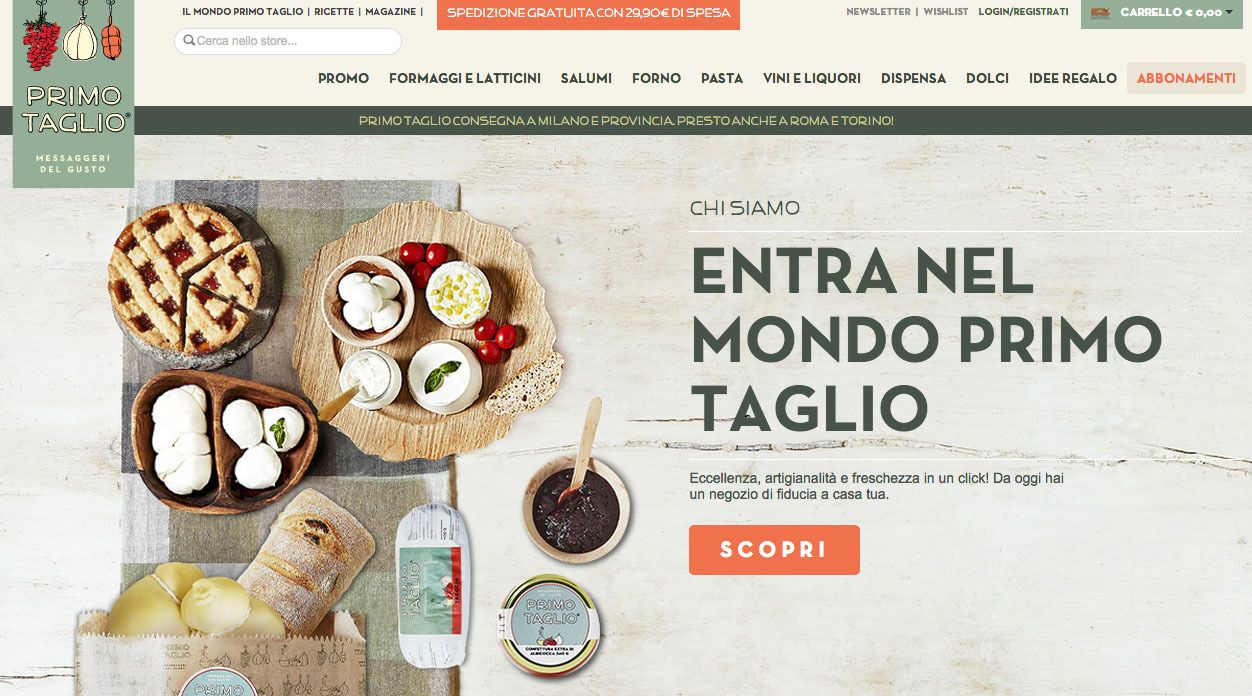
Homepage
I updated important layout sections, sometimes replacing the page at all, creating A/B testing in order to update and optimize the UX heuristics of specific page sections.
Added new sections
I suggest to create and highlight, a new promo section and one of the best selling product in order to drive more sales and an higher AOV, using:
- Promo section: part of the orders was driven by promo products.
- Best selling product: most of the orders contains 1.5 times one of the best selling product.
One of the most frequent friction I noticed, it was their credibility as company, being a spin-off, they weren't well known to target audience. They worked pretty much well with PR, traditional media and the press and I decided to put this highlighted in the pre-footer section, as persistent information.
The Product page
In the image below, you see the redesigned product page which gave us a boost for conversion rate increasing drastically the average time on page.
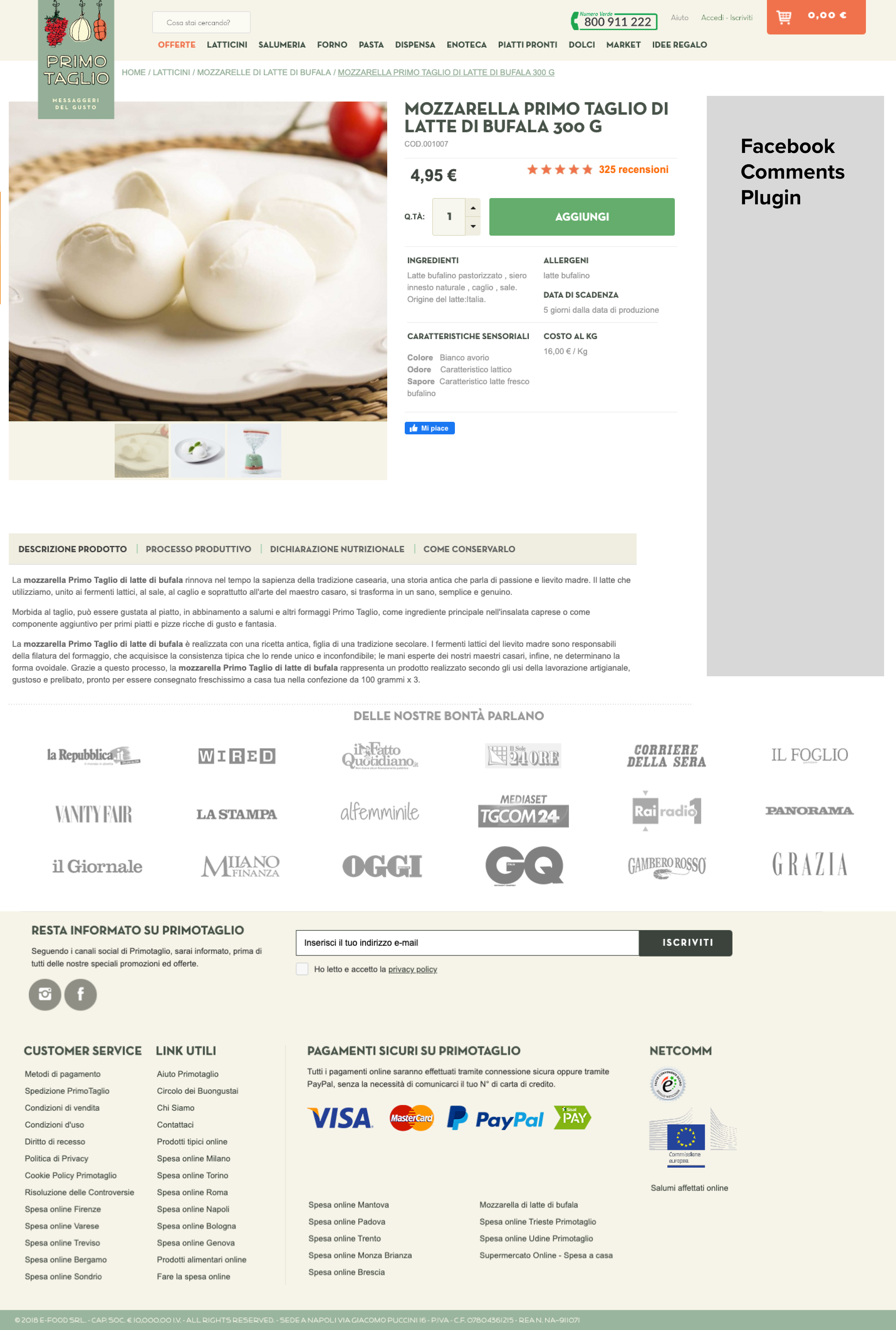
A bigger product name, clear information about the price and the details. In ths sidebar I added facebook comments for social proof.
I fixed UX issues and added more product informations, such as:
- Green and more visibile call to action
- Crafted a new section that synthetically explain all product information: ingredients, allergens, expiration date and so on.
- Moved the quantity input near the CTA
- Facebook customer reviews in the sidebar section for social proof
Added new tabbed sections, below the product images, after the line of above the fold which the specific goal to provide a more detailed information: "how to keep it", "nutritional facts" and the productive process.
Marketing Automation
An important methodology was involved at this game: marketing automation. I created flows which have had specific goals, based on customer behaviours and events.
I delivered small discounts and specific promotions to grew up the AOV (Average Order Value) to the right customers, moving most of them in Frequent Buyers.
The customer scoring helped me to create another dimension, make me able to understand how "hot" they were, delivering them, high valued promotions for the most active cluster.
Primo Taglio achieved a x5 increased in revenue, which resulted from improvements to the overall average order value (AOV), conversion rate (CR) and a significant boost in user experience (UX) scores.